 Wordaizer -
Help Wordaizer -
Help |
 Wordaizer -
Help
Bending words
This
feature is available from Wordaizer 3.0 onward. The effect is fabulous: instead
of placing words in a straight line (horizontal, or at
any angle) it will use curved placement paths. This path can be a
circle, a parabola, a wave or like a crossword: vertical placement with
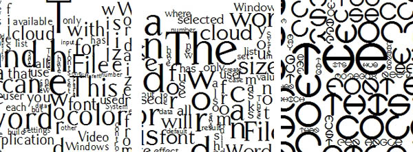
no angle. Below you find typical placement examples of
each of the 4 bending types. From left to right: crossword, wave, parabolic and
circular. Different colours, different font with different density were applied to show how versatile this feature actually
is. The four bending
types The following controls are
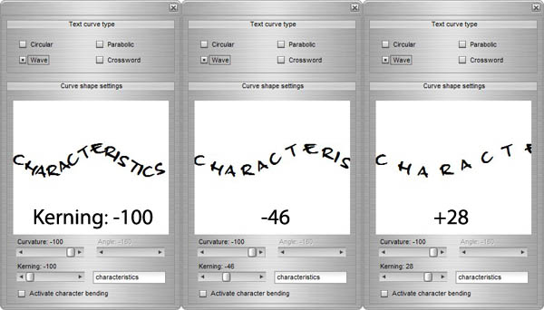
available: Picture
above: example of kerning. From left to right the kerning value increases (here
from -100 to +28).
How to work with
bending words Examples Picture
below: effect of the starting angle for the 'Circular' bending. The initial value of each bended word
is set in the 'Shape' window. This is not the same
angle as in the bending options! Left: no angle (always starting in the same horizontal direction), right: starting angle of 45 degrees (starting clockwise and
anticlockwise). This effect is comparable with non-bended words where a random orientation is selected of
the indicated angle (so: 45 degrees mean randomly selecting 45 and -45
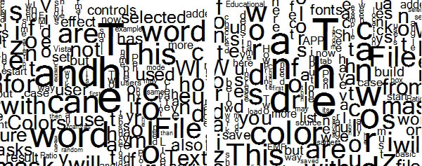
degrees). Picture
below: influence of the font type on the effect of a crossword bending type
(technically, this is not word bending). It clearly shows that crossword bending
effect is not predictable. And it's a matter of taste which font suits the best.
From left to right these fonts were used: Carmelia
, Centabel Book and Heather
Thomas. Picture below: effect of
kerning values on the placement of smaller words (for crossword type). From
left to right: kerning = 35 and kerning = 150. As can be noted at large kerning
values words can be put (in and) between characters easily. 
The application offers four types of
word bending. Each of them is shown in the picture below. From left to right: circular,
wave, parabolic and crossword. Each of the types has a couple of controls
for defining the basline curve. The word that
is shown in the window is the longest word that was found in the
text file.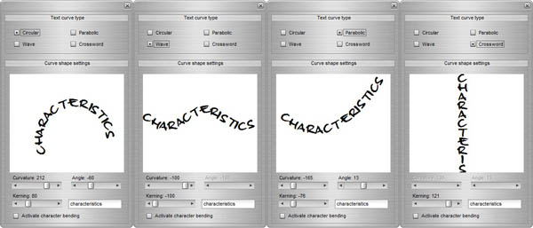
In most cases the bending effect is self-explaining. A
couple of good practices though may be useful.
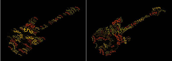
Picture below: effect of a 'start-up' and
'start-down' initial direction for the parabolic bending. Because of the
diagonal guitar mask the effect of the curvature is outspoken different. Left:
curvature downward, right: curvature upward.
